 When your customers engage with your company website, where do they do it? In the office, maybe, or while relaxing at home? And how do you know: do you have the data to prove it? While we can all make educated guesses about the way people use our sites, we never really know without looking at figures and statistics.
If you have a smartphone or a tablet, use it to navigate to your company’s site. How is the experience for you? If you see a miniaturised version of your desktop site that’s impossible to navigate on a smaller sized screen, you’ll understand why the experience is off putting. Tiny menus, cramped text and inaccessible navigation are just a few of the reasons your website could be turning people away.
 The Solution
Responsive website design means optimising a site so that it is functional and attractive on every device used to view it. The site detects the user’s device and screen size, then renders a version of the page that fits.
The key to responsive design is to maintain the overall look and usability of a site, but also to make sure the user experience is optimised no matter the device they are using. Increasingly, responsive design is being used as an alternative to running mobile and desktop websites side by side.
While you’ll need to invest in a redesign, there are many good reasons to choose a responsive layout:
- Content only needs to be created once. This is much more efficient than creating multiple sites and placing content on all of them
- The user experience is consistent across all devices, aiding user engagement
- Users can do everything on every device, so you avoid giving them a poor experience
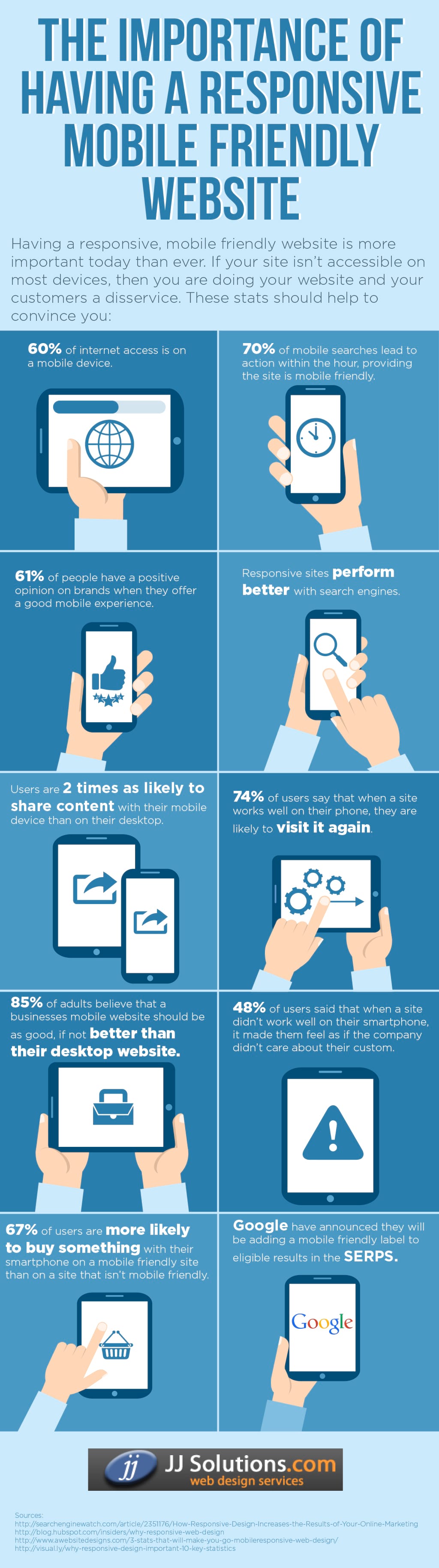
- You will capture mobile traffic, and there’s plenty of it; in 2014, nearly 27 percent of all website traffic in the UK originated from a mobile device
The Redesign
Starting from scratch is usually the best approach, but don’t be too concerned. Most major brands have redesigned for responsive layouts, and they arguably have much better websites as a result.
The greatest enemy to responsive design is complexity, and the greatest challenge is downloading times. It’s important to make sure that your site’s content is easily accessible, and remains useful and engaging no matter the type of device that it is downloaded to. And it’s critical that big, beautiful photos and videos can be downloaded just as easily on 3G as they can on cable broadband. If not, they need to eradicated from the small-screen versions.
In a responsive website design, your links should be as easily accessed via the stab of a finger as they can via a mouse pointer.
Responsive design is also important when it comes to how search engines view your site, and how they rank it in search results. One single URL for all devices will ensure that you don’t accidentally publish duplicate content. It will also help us to keep track of your marketing and sales goals, since all the traffic is going to one site, and one URL.
Go For It
In 2007, desktop internet users outnumbered mobile internet users by three-to-one. In 2014 the number of desktop internet users and mobile internet users equalised for the first time. By the start of 2016, it’s estimated that mobile internet users will have pulled way ahead of those accessing the internet via desktops.
If, by the end of 2016, your company website still gives a poor mobile performance, then you are dissuading over 50 percent of your potential audience from engaging with you. Going responsive makes sense. And the businesses who have already invested are reaping the rewards.